
Your logo is often the first thing a customer notices about your business, and it is usually the thing they remember longest. A well-designed logo can make a new company look established and trustworthy, while a rushed or generic mark can quietly undermine even the best product or service. That is why understanding the logo design process matters so much before you commission anything: when you know how the work is done, you can brief a designer properly, judge the concepts fairly, and end up with a mark that serves your business for years.
For businesses searching for professional logo design UK, the challenge is not finding someone who can draw a logo. It is finding a designer who follows a proper process — one that starts with your customers and your market, not with a blank artboard and a favourite font. This guide walks through that process stage by stage, from the first discovery conversation to the final files and brand guidelines, so you know exactly what to expect and how to avoid the mistakes that lead to weak, short-lived logos.
What professional logo design actually means
Professional logo design is not about producing a pretty picture. It is about solving a business problem with a visual mark. A professional designer starts by understanding what your business does, who it serves and how it wants to be perceived, then translates that into a simple, memorable mark that works everywhere your business appears — on your website, your invoices, your social profiles and your shopfront.
The difference between professional work and a quick online logo is the thinking behind it. A professional logo is built to last, to reproduce clearly at any size, and to sit comfortably alongside everything else your business produces. That is why the process matters: it is what turns a nice graphic into a working business asset.
A logo is a business asset, not a decoration
A logo earns its keep every time a customer sees it. Over time it becomes shorthand for everything customers think about your business — your quality, your reliability, your personality. When that shorthand is clear and consistent, it builds recognition and trust; when it is confused, it does the opposite.
The difference between a logo and a brand identity
A logo is one part of a wider brand identity. The logo is the mark itself, while brand identity is everything around it: colours, typography, imagery and layout rules. A strong logo needs that wider system to work at its best, and a strong identity needs a strong logo at its centre.
What a professional logo must do on day one
From day one, a professional logo must be legible, distinctive and usable: readable at small sizes, different from competitors, and workable on your website, on print and on a phone screen. It must also feel right for your market — a law firm and a children’s play centre should never carry interchangeable marks.
Why the process matters more than the first draft
Clients sometimes expect the first draft to be the finished logo, but the first concepts are a starting point, not a conclusion. The real value of a professional process is the sequence — research, direction, concepts, feedback, refinement and testing — which sharpens the work and reduces the risk of launching a logo that looks fine on screen but fails in the real world.
How a structured process protects your investment
A logo touches almost everything your business produces, so changing it later is costly: websites need updating, printed material needs reprinting and customers need time to relearn who you are. A structured process catches problems early — a mark too detailed to reproduce, a colour that clashes with your sector — before the logo is rolled out.
Professional logo design UK: the process at a glance
Most professional logo projects in the UK follow the same seven stages, whether the designer is a freelancer, a small studio or a larger logo design company UK: discovery, research, creative direction, concept development, feedback and refinement, testing, and final delivery. Each stage builds on the one before it, so skipping ahead usually means going back later to fix something that should have been settled earlier.
Understanding the stages helps you play your part well. You will know when to share information, when to give feedback and when to step back and let the designer work. It also helps you compare providers fairly: a one-day turnaround with no discovery is not the same service as a structured process over several weeks.
The seven stages in order
The seven stages are discovery and the design brief, research and market direction, creative direction, concept development, feedback and refinement, testing, and final files and rollout. Each one produces something useful even before the logo is finished — the brief clarifies your goals, the research reveals what to avoid, and the testing gives you confidence.
How long each stage usually takes
Timelines vary with the complexity of the project and how quickly feedback comes back. Discovery and research often take the longest in thinking time, even though they produce the least visible work. As a general guide, a thorough professional logo project takes weeks rather than days — that is not slowness, it is the time needed for research, creative thinking and proper testing.
Who is involved at each stage
You are most involved at the beginning and during feedback, because your knowledge of your business, your customers and your ambitions is the raw material the designer works from. The designer leads the research, creative direction and concept work. Keeping the decision-making group small helps: when too many people give feedback, the logo often ends up trying to please everyone and satisfying no one.
What you need to provide before work starts
Before design begins, your designer will need a clear picture of your business: what you do, who your customers are, what makes you different, where the logo will be used, and any existing brand material you have. You do not need design terminology or a finished idea — what you need is clarity about your business and your audience, and a willingness to answer questions openly.
Stage 1: Discovery and the design brief
Discovery is the foundation of the whole project. A good discovery conversation feels like a proper business discussion, not a form-filling exercise. The designer should be curious about your customers, your competitors, your history and your plans, and should ask follow-up questions that show they are listening rather than simply ticking boxes.
The outcome of discovery is a design brief: a short, agreed document that captures what the logo needs to do, who it needs to appeal to, where it will appear, and what feeling it should convey. The brief becomes the reference point for every later decision, so concepts are judged against it rather than against personal taste alone.
The questions a good designer asks first
A good designer will ask about your business model, your customers and your competitors before they ask about colours or fonts. They will want to know who buys from you, why they choose you, what they value most, and what might put them off — as well as where the logo will appear and whether there are practical constraints such as a very long business name.
Your business, customers and competitors
Your business story shapes the creative direction. A family-run business with decades of history might suit a mark that feels established and trustworthy, while a new start-up might suit something cleaner and more forward-looking. Understanding your customers matters just as much: a logo that appeals to busy parents will look different from one aimed at corporate buyers.
Where the logo will actually appear
A logo that lives mainly on a website has different needs from one that must work on a shop sign, a delivery van, embroidered workwear or packaging. Size, distance, background and production method all affect what will work — a detailed illustration might look beautiful on screen but become a blur when embroidered on a polo shirt.
Writing a brief that gets better concepts
A good brief is clear, honest and specific. It states what the business does in plain language, who the customers are, what the logo must communicate and where it will be used, plus any must-haves and must-avoids. Showing a designer three logos you admire — and explaining what you like about each — is far more useful than asking for something modern and professional, words that mean different things to different people.
Common brief mistakes to avoid
The most common mistake is being too vague: asking for a logo that appeals to everyone without saying how. Another is being too prescriptive, insisting on a specific symbol or colour before the research has been done. Both limit the designer. Also beware letting personal taste dominate — your logo is for your customers, not for you alone.
Stage 2: Research and market direction
Once the brief is agreed, the designer moves into research. This stage is invisible to most clients, but it shapes everything that follows. The designer studies your sector, your competitors and your audience, looking for patterns, gaps and opportunities — not to copy what others do, but to understand the visual language of your market so your logo can speak it fluently while still sounding like itself.
Research also protects the project from cliché. Every sector has its overused symbols — the house for property, the leaf for anything natural, the globe for anything international — and a designer who has done the research can spot them before they creep into your concepts.
Competitor and industry research
Competitor research starts with a simple question: what do the logos in your sector actually look like? The designer gathers examples from direct competitors, then looks for patterns in colour, typography, symbols and layout. Those patterns reveal what customers already associate with your sector — and where there is room to be different.
Spotting the visual clichés in your sector
Visual clichés are shortcuts that once felt fresh and have since become tired: a lightbulb for ideas, a swoosh for speed, a handshake for partnership. A logo built on a cliché tells customers nothing new about your business. A good designer will name the clichés in your sector and deliberately avoid them, or find a fresh way to express the same idea.
Audience and positioning
Research also covers your audience and your positioning. A logo for a premium service needs to signal quality and attention to detail; a logo for a value-led business needs to feel accessible and straightforward. Are you the established expert, the friendly local choice, the innovative challenger or the premium option? Your logo should reflect that position consistently.
How positioning shapes the creative direction
Positioning shapes every creative choice that follows: the style of the mark, the weight of the typography, the warmth or coolness of the colours, and the amount of detail. A premium positioning might favour restrained typography and a muted palette, while a friendly positioning might favour softer shapes and warmer colours. Without a clear position, those choices are guesses; with one, they are decisions.
Stage 3: Creative direction — colour, type and style
Creative direction is where the research becomes a visual plan. Before any finished concepts are drawn, the designer decides on the overall style — wordmark, symbol or combination — plus the colours, typography and feeling the mark should convey. This direction is often shared with the client as mood boards, so both sides agree on the visual language before detailed design begins.
This stage saves time and avoids misunderstandings. It is far easier to adjust a direction now — to say the colours feel too corporate, or the style too playful — than to redraw finished concepts later. It also keeps the concepts coherent, so the client sees variations on a considered direction rather than three unrelated ideas.
Choosing a logo style: wordmark, symbol, or combination
Most logos fall into three broad styles. A wordmark is the business name set in a distinctive typeface, with no separate symbol. A symbol is a graphic device that can stand alone. A combination mark pairs a symbol with the business name. Wordmarks suit short, distinctive names; symbols suit businesses needing a compact mark for avatars and packaging; combination marks are the most flexible, since the parts can be used together or separately.
When a symbol works — and when it does not
A symbol works when it is simple, memorable and meaningful: easy to describe, recognisable at a small size, and clearly connected to the business. It fails when it is too detailed, too abstract or too generic — a complicated illustration loses its detail at small sizes, and a generic symbol could belong to any business in your sector. If a symbol does not make the logo stronger, a well-crafted wordmark is often the better choice.
Colour psychology for UK audiences
Colour carries meaning, and UK audiences read those meanings quickly. Blue is widely associated with trust and professionalism, green with growth and calm, while warm colours such as orange and red feel energetic and bold. A professional designer also thinks practically: a logo that depends on a subtle gradient or a very pale shade will struggle in print, on signage and in a single colour.
Typography: the voice of your logo
If colour is the mood of a logo, typography is its voice. A classic serif feels traditional and established, a clean sans-serif feels modern and straightforward, a rounded typeface feels friendly. The name must also be legible at small sizes, and the typeface must be licensed for commercial use. Designers often customise letterforms slightly so the wordmark feels made for your business rather than typed out in a standard font.
Mood boards and style direction
Mood boards gather images, colours, type samples and textures that capture the feeling the logo should convey. They are not designs to copy, but references that show the client what the designer is thinking. Sharing them early gives the client a chance to react while the direction is still easy to adjust — one of the most valuable conversations in the whole process.
Stage 4: Logo concept development
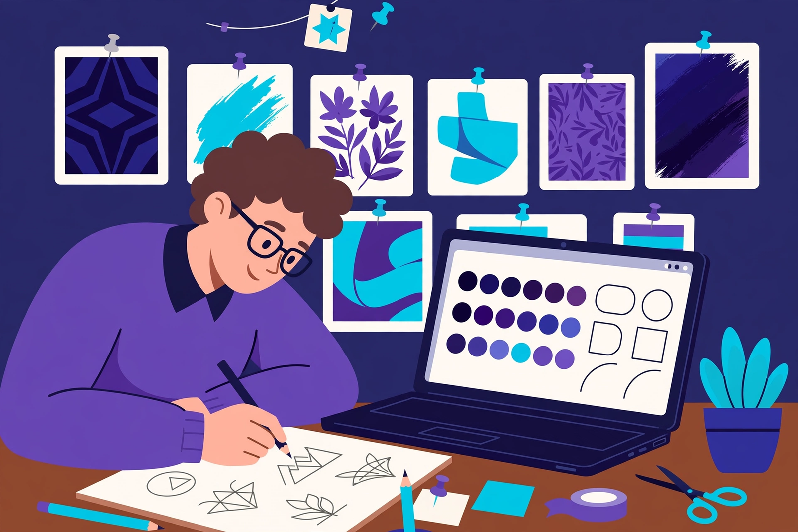
Concept development is the stage most clients imagine when they think of logo design: the designer sketching ideas and turning the best ones into polished concepts. In practice it is disciplined work. The designer explores many ideas quickly — often on paper first — before selecting a small number to develop properly, aiming for a few strong, distinct directions that each solve the brief differently.
Each concept should be presented in context, not just as a mark on a white background: at different sizes, in colour and in black and white, and on realistic mockups such as a website header or a business card. That context helps the client judge how the logo will actually feel in use.
How many concepts should you expect?
Most professional logo projects present between two and four concepts. Fewer gives the client too little choice; more often means the ideas have not been properly filtered. Three well-considered concepts that each take a different approach to the brief are far more useful than ten variations on the same idea.
Sketching first, software second
Many designers begin on paper, sketching dozens of rough ideas quickly before touching design software. Sketching keeps the focus on the idea itself — the shape, the structure, the meaning — because software can make a weak idea look polished before it has been properly thought through. The best sketches are then redrawn digitally, where proportions and spacing can be refined with care.
What a good concept presentation looks like
A good presentation explains each concept, not just shows it. The designer should describe the idea behind the mark, how it connects to the brief, and why the colours and typography were chosen. That rationale helps the client judge the work on strategy rather than on a first impression alone — a concept that looks unfamiliar at first may be the strongest once its thinking is explained.
Judging concepts on strategy, not taste
When you first see concepts, your instinct will be to react to whether you like them. That reaction matters, but it should not be the only test. Ask instead: does this reflect our business and our customers, does it stand out from competitors, is it simple enough to remember, and would it work on our website, signage and social profiles? It also helps to live with the concepts for a day or two before deciding.
Stage 5: Feedback and refinement
Feedback is where the chosen concept becomes the finished logo. The designer takes your response, identifies what is working and what needs to change, and refines the chosen direction with care. Small changes at this stage — a slightly heavier stroke, better-spaced letters, a cleaner curve — can make a large difference to how the logo feels.
This stage works best as a conversation. If the right concept was chosen, refinement will strengthen it. If the feedback keeps pulling in a different direction, it may be a sign that the brief or the direction needs revisiting, and an honest designer will say so rather than letting revisions drift.
How to give feedback designers can use
Useful feedback is specific and tied to the brief. Instead of saying a logo feels wrong, explain what feels wrong: the type feels too formal for our customers, the symbol is hard to read at a small size, the colour feels too cold for a friendly business. It also helps to say what is working, so the designer knows what to keep while adjusting the rest.
The difference between useful and unhelpful feedback
Useful feedback describes a problem and lets the designer solve it. Unhelpful feedback prescribes a solution without explaining the problem: make the logo bigger, use this exact blue, add a swoosh. Those instructions often pull the design away from the strategy towards a collection of personal preferences. Share what you need the logo to achieve, and let the designer decide how to draw it.
Revision rounds: what is reasonable?
Most professional logo projects include a defined number of revision rounds — often two or three — focused on refining the chosen concept. That is usually enough to resolve the details and reach a logo both sides are happy with. The rounds are for improvement, not for exploring entirely new directions, which is why choosing the right concept before refinement begins matters so much.
When to stop refining
There comes a point where further refinement makes a logo worse rather than better: the mark becomes overworked, the simplicity is lost, and the changes are driven by restlessness rather than a real problem. A professional designer knows when a logo is finished — when it meets the brief, works in its real uses and feels resolved. Trust that judgement.
Stage 6: Testing the logo in the real world
Testing is the stage that separates professional logo design from a design that only looks good in a presentation. Before final delivery, the logo should be tested where it will actually be used: at very small sizes and very large ones, in a single colour, on light and dark backgrounds, on a website, on print and on a phone screen. A logo that passes those tests is ready to launch; one that fails them needs more work.
Testing also means stepping back: does the logo still feel right alongside your competitors, on a busy webpage, or on a shopfront seen from across the street? It is far better to find those problems now, while they can still be fixed, than after the logo is printed, painted and published.
The scalability test: favicon to shopfront
A logo must work at every size, from a tiny favicon in a browser tab to a large shop sign. At the small end, fine detail disappears and small text becomes unreadable; at the large end, any roughness in the curves or spacing becomes obvious. Test it yourself at the extremes: shrink it to the size of a postage stamp and ask whether it is still recognisable, then enlarge it and look for awkward spacing.
The one-colour test
Strip the colour away and look at the logo in black on white, then in white on black. Is it still clear, distinctive and readable? A logo that depends on colour to be understood will fail whenever it has to be printed in one colour, embroidered, engraved or stamped. If the mark works in a single colour, it has a strong shape and structure; if it falls apart without colour, the structure needs more work.
Testing on real mockups
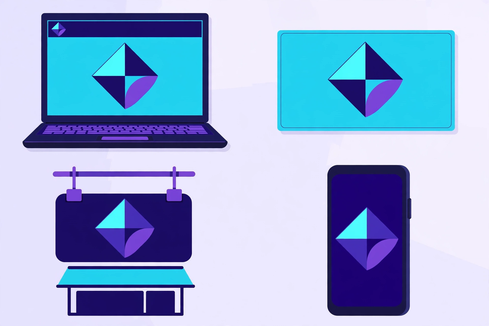
Mockups show the logo where it will live: on a website header, a business card, a shop sign, a van, a social media profile or packaging. They reveal practical issues a plain presentation hides — a wordmark too wide for a mobile header, a symbol lost on a busy photograph, a colour that is hard to read on a dark background. Ask to see mockups that match your real uses, not just generic ones.
Accessibility and legibility checks
A professional logo should be legible to as many people as possible, including people with low vision or colour blindness. That means checking contrast against the background, avoiding colour combinations that are hard to distinguish, and making sure text is large and clear enough to read. A logo that is easy to read and recognise is easier to remember — and easier to trust.
Stage 7: Final files, brand guidelines and rollout
The final stage is delivery: the designer hands over the finished logo in every format you will need, along with the rules for using it consistently. Without the right files, you will struggle every time you need the logo for a new purpose — a printer will ask for a vector file you do not have, a web developer will ask for a transparent PNG, a sign maker will ask for a single-colour version.
Brand guidelines record how the logo should and should not be used: the colours, the clear space around it, the minimum size, the approved backgrounds and the versions for different situations. They protect the consistency of your brand as more people use the logo — staff, printers, web developers and social media managers.
Every file format you should receive
You should receive your logo in both vector and raster formats, in colour and in single-colour versions, and with transparent backgrounds where appropriate. Vector files can be scaled to any size without losing quality and are essential for print and signage; raster files are made of pixels and suit screens and everyday digital use. Keep the originals safe and share copies as needed.
Vector files: SVG, AI and EPS
Vector files — usually SVG, AI or EPS — store the logo as shapes and curves rather than pixels, so they can be enlarged to any size without becoming blurry. SVG is widely used for websites, AI is the working file from the design software, and EPS is a long-established print format many printers still request. Check the files open correctly before the project closes.
Raster files: PNG and JPG
Raster files — PNG and JPG — are the formats you will use most often day to day. PNG is best when you need a transparent background, for example when placing the logo over a photograph. JPG is best where file size matters, but it does not support transparency. You should receive raster versions in several sizes, in colour and single-colour forms, including versions for light and dark backgrounds.
Brand guidelines: the rulebook that protects consistency
Brand guidelines do not need to be a long document. For many small businesses, a few pages are enough: the logo versions, the exact colours, the typography, the clear space and minimum size, and examples of correct and incorrect use. Consistency is what turns a logo into a recognisable brand — when customers see the same mark used the same way everywhere, they learn to recognise you quickly.
Rolling the logo out across your business
Rollout means replacing the old logo with the new one everywhere it appears. Start with the places customers see most: your website, your Google Business Profile, your social media profiles, your email signature and your invoices, then move to printed material, signage and uniforms. A short checklist helps make sure nothing is missed — and update saved templates so the old logo does not reappear by accident.
How to design a logo: DIY vs hiring a logo designer UK
Many UK business owners start by asking whether they can design a logo themselves. The honest answer depends on what the logo needs to do. For a hobby project or a very early test of an idea, a do-it-yourself approach can be reasonable. For a business that depends on trust, recognition and professional presentation, a professionally designed logo is usually the better investment.
The choice is not only about design skill. It is about strategy, research, originality and the practical files you receive at the end. A DIY logo maker can produce something tidy, but it rarely produces something researched, distinctive and built to work across every use your business will need.
When DIY makes sense
DIY makes sense when the stakes are low and the budget is genuinely tight — testing a business idea, running a short-term project, or needing a simple placeholder while you decide on a longer-term brand. It can also be a useful way to explore what you like and dislike before briefing a professional, as long as you treat it as an experiment rather than a final solution.
The real limits of logo makers and templates
Logo makers have three serious limits: originality, strategy and ownership. They draw from a shared library of icons and layouts, so your logo is likely to resemble many others; they do not research your market or customers, so the result is generic by design; and the files may not be true vectors, with licensing that is unclear. A template logo that looks fine on a website may fail completely when you need it for print or embroidery.
| Approach | Best for | Main limitation |
|---|---|---|
| DIY logo maker | Testing an idea or a short-term project | Generic, not researched, limited files |
| Freelance designer | A focused logo project with direct contact | Capacity and wider services vary |
| Logo design agency | A logo plus brand identity and rollout | A more involved, structured process |
What a professional logo designer UK brings
A professional logo designer UK brings more than drawing skill: research, strategy and experience. They ask the questions a template cannot ask, spot the clichés a logo maker cannot spot, and test the mark in ways a DIY tool does not. They also bring accountability — working to a brief, presenting a rationale, welcoming structured feedback and delivering proper files and guidelines.
How to choose between a freelancer, an agency and a logo design company UK
A freelancer can be an excellent choice for a focused logo project, especially if you want direct contact with the person doing the design. An agency or a logo design company UK is often better when you need more than a logo alone — a full brand identity, a website and printed material that all work together. The right choice depends on the scope of what you need, not on which option sounds more impressive.
Logo design services: what is usually included?
When you compare logo design services, it helps to know what a professional service usually includes, so you can compare like with like. A complete service should cover discovery, research, creative direction, concepts, revisions, testing and final delivery, with the files and guidelines you need to use the logo confidently. If a service offers only the design itself, with no research, no revisions and no proper files, it is not the same service.
It also helps to understand what is not included. A logo service does not usually include trademark registration, which is a separate legal step, nor a full website or printed materials unless those are agreed separately. A clear proposal should state what is included, how many concepts and revisions you will receive, what files you will get, and how long the project will take.
What to expect from professional logo design services
Expect a structured start: a discovery conversation, a written brief and a clear timeline. Expect research into your market and competitors, a creative direction you can respond to, a small number of well-developed concepts presented with a rationale and in realistic context, structured feedback and refinement, proper testing, and a final delivery of vector and raster files plus brand guidelines.
Concepts, revisions and file delivery
Concepts, revisions and file delivery are the three practical parts to check carefully: how many concepts you will see and how distinct they will be, how many revision rounds are included and what counts as a revision, and what files you will receive in which formats. A professional service will answer all three clearly and in writing before work starts.
Red flags when comparing logo design services
Watch for a service that promises a finished logo in a day with no discovery and no research, one that shows only mockups with no real client work, or one that cannot explain its process or put the scope in writing. A service offering dozens of concepts for a very low fee is almost certainly using templates. Unclear ownership is another red flag: you should own the final logo and receive the files you need to use it.
Questions to ask before you commit
Before committing, ask about the stages and timing, the deliverables, and the team: who will design the logo, and will you speak to them directly? Ask to see work for businesses similar to yours, with the thinking behind it explained. Finally, ask what happens after you say yes — a good designer can tell you exactly what they need from you and when you can expect to see the first work.
Common logo design mistakes UK businesses make
Even good businesses make avoidable logo mistakes, and most of them come from rushing the process or judging the work on the wrong criteria. The mistakes below are common, but they are also easy to avoid once you know what to look for — and a professional process is designed to prevent them, though an informed client is the best protection of all.
Each of these mistakes is understandable. Trends are tempting, personal taste feels important, and a complex logo can feel like it says more about the business. But a logo that follows a trend, tries to say everything at once, or pleases only its owner will usually need replacing sooner than one built on strategy, simplicity and real-world testing.
Following trends instead of strategy
Trends change quickly, and a logo built on a trend will date quickly with it. That does not mean a logo should ignore current design — it should feel contemporary — but its strength should come from strategy, not fashion. Ask: would this logo still feel right in five years if the trend had passed? If not, the design leans too heavily on a passing style.
Too many ideas in one mark
A common mistake is trying to fit everything the business does into a single logo: a symbol for each service, a tagline, a location and a founding date, all crowded into one mark. Customers cannot take in that much information at a glance. A strong logo says one thing clearly rather than many things confusingly — simplicity is the discipline to choose the strongest idea and let it speak.
Ignoring where the logo will be used
A logo designed only for a website header will often fail when it meets the real world: too wide for a mobile screen, too detailed for embroidery, too pale for a dark background, too complex for a small social media avatar. Design for real uses from the start — share where the logo will appear and check the one-colour version before you approve it.
Choosing on personal taste alone
Personal taste matters, but it should not be the only test. A logo is a business tool: its job is to appeal to your customers, stand out from competitors and work in its real uses. A mark you love but your customers find confusing is not doing its job. Balance personal response with strategic judgement, and use the brief to keep the decision grounded in what the business needs.
How WappexSol’s logo design process works
At WappexSol, the logo design process follows the same principles described in this guide: start with your business and your customers, research the market, agree a creative direction, develop strong concepts, refine the chosen mark, test it properly, and deliver the files and guidelines you need. As a UK logo design company UK, WappexSol works with businesses across the country, from new start-ups needing their first identity to established companies refreshing a mark that no longer reflects who they are.
The aim is always the same: a logo that is distinctive, practical and built to last, supported by a brand identity that makes your business look consistent and professional everywhere it appears. The process is collaborative throughout, so you know what is happening at each stage and when your input is needed.
Working with a UK logo design company
Working with a UK logo design company means working with a team that understands the UK market: the expectations of British customers, the visual language of UK sectors, and the practical needs of businesses operating here. WappexSol’s graphic design team works closely with clients from the first conversation to final delivery, presenting concepts with a clear rationale so you can judge them on strategy as well as on how they look.
From first call to final files
From the first call, the focus is on understanding your business: what you do, who you serve, what makes you different and where the logo will be used. That understanding becomes the brief, which guides the research and creative direction. Concepts are developed and presented in context, refinement follows, then testing, then delivery — with no surprises about scope, timing or files, because those are agreed at the start.
Logo design and brand identity, together
A logo is strongest when it is part of a wider brand identity. WappexSol treats brand identity design as one joined-up piece of work, so the colours, typography and style that will carry through to your website, your social profiles, your printed material and your signage are planned together from the start. That joined-up thinking means the identity feels coherent from the start, rather than assembled from separate pieces later.
Beyond the logo: websites, print and social
A logo rarely lives alone. It appears on your website, your business cards, your social profiles, your invoices and often your packaging or signage. WappexSol’s team can carry the new identity through to those touchpoints, including web design that uses the new brand consistently, social templates that make everyday posting easier, and print-ready files for cards and letterheads.
If you are ready to start your logo project, or you would like to talk through what your business needs, the WappexSol team would be glad to hear from you. Share a little about your business, your customers and where your logo will be used, and the team will talk you through the process, the timing and what to expect at each stage. There is no obligation, and the first conversation is simply a chance to see whether working together feels right.
You can start the conversation on WhatsApp, call the team on +44 7435 738263, or email info@wappexsol.com. Whether you need a first logo for a new business, a refresh of an existing mark, or a full brand identity to go with it, the team will give you honest advice and a clear next step. Your logo is the face of your business — it is worth designing properly, with a process you can trust.
Logo design process — frequently asked questions
How long does the logo design process take?
A thorough logo design process usually takes several weeks from the first discovery conversation to final file delivery. Discovery and research take time because they shape every creative decision that follows, and concept development needs space for ideas to be properly explored. Timelines vary with the complexity of the project and how quickly feedback comes back, so share any hard deadline at the start and your designer can plan the stages around it honestly.
How many logo concepts will I see?
Most professional logo projects present between two and four concepts. Each concept should take a distinct approach to the brief, with a clear rationale and realistic mockups so you can judge how it will work in practice. Three well-considered concepts are far more useful than a large number of similar variations, because the designer has already filtered the ideas and developed only the strongest directions properly.
What files should I receive with my finished logo?
You should receive your logo in both vector and raster formats, in colour and in single-colour versions, and with transparent backgrounds where appropriate. Vector files such as SVG, AI and EPS can be scaled to any size without losing quality and are essential for print and signage. Raster files such as PNG and JPG are suited to screens and everyday digital use. You should also receive brand guidelines covering colours, clear space, minimum size and correct use.
Should I choose a freelancer or a logo design company in the UK?
It depends on the scope of what you need. A freelancer can be an excellent choice for a focused logo project with direct contact with the designer. A logo design company in the UK is often the better choice when you need more than a logo alone, such as a full brand identity, a website and printed material that all work together. Look at real client work, ask about the process and deliverables, and choose the option whose experience best matches your project.
Can I trademark my new logo?
A professionally designed logo can usually be considered for trademark protection, but trademark registration is a separate legal step and is not part of the design service itself. Before applying, it is important to check that your mark is distinctive enough and does not conflict with existing trademarks in your sector. A trademark attorney or the UK Intellectual Property Office can advise on availability and on the application process for your specific mark.